Showing posts with label Liana. Show all posts
Showing posts with label Liana. Show all posts
Monday, 16 March 2015

Saturday, 7 March 2015
Friday, 6 March 2015
Thursday, 5 March 2015
Wednesday, 4 March 2015
Target audience feedback on our trailer
As part of our target audience feedback we created at survey and handed it out randomly to receive a mix of answers and varied responses from people. We thought this was a good way for getting useful feedback on our trailer on things such as consumer satisfaction and weather people thought our trailer fitted well with the horror genre. This would be a way of gaining criticism and praise to evaluate what we could do better in the future.
The questions we asked were:
1. Did you enjoy the Trailer?
2. Do you feel our trailer presents the genre horror?
3. Would you go and view this film in the cinema?
4. What age rating would you rate the film?
5. Is there anything you didn't like about the trailer?
These were peoples responses:
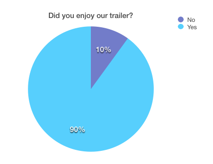
We also handed out questionnaire containing 3 questions about our trailer in general. We then used this data to create pie charts showing the percentages of people who say yes or no. Here are the questions that were included in our questionnaire:
1. Did you enjoy our trailer?
2. Would you purchase the film?
3. Is the film targeted to the correct age group?
Here is the data represented into pie charts:


The questions we asked were:
1. Did you enjoy the Trailer?
2. Do you feel our trailer presents the genre horror?
3. Would you go and view this film in the cinema?
4. What age rating would you rate the film?
5. Is there anything you didn't like about the trailer?
These were peoples responses:
We also handed out questionnaire containing 3 questions about our trailer in general. We then used this data to create pie charts showing the percentages of people who say yes or no. Here are the questions that were included in our questionnaire:
1. Did you enjoy our trailer?
2. Would you purchase the film?
3. Is the film targeted to the correct age group?
Here is the data represented into pie charts:
Tuesday, 3 March 2015
Monday, 2 March 2015
Did we stick to our plan?
Before filming our trailer we created a rough story board including what will happen in each scene in the correct order. We also made rough notes as to what camera angles/ techniques we would use to film each scene.
Although maintaining the main story line we added some extra scenes that weren't in our story board e.g we added scenes of our main character locking different doors to show she was frightened which created higher levels of tension in our trailer.
We also added different camera angles and techniques to what we originally planned. This was due to what we felt worked better in terms of professionalism.
In our original story board we also had a male character who was trapped in the house as well. We however, did not stick to this idea as we felt a third character was not necessary when filming.
Although maintaining the main story line we added some extra scenes that weren't in our story board e.g we added scenes of our main character locking different doors to show she was frightened which created higher levels of tension in our trailer.
We also added different camera angles and techniques to what we originally planned. This was due to what we felt worked better in terms of professionalism.
In our original story board we also had a male character who was trapped in the house as well. We however, did not stick to this idea as we felt a third character was not necessary when filming.
Sunday, 1 March 2015
Challenges we faced during editing
Editing our trailer was a time consuming process due to our genre being based around unrealistic aspects. One thing we struggled with the most was sound. We edited sound effects into each scene as apposed to having one song or music track throughout the trailer. We struggled with the timing of our sound effects and getting all the music to flow together. For example timing the sound of the ringing phone in time with the other violin music we had on top.
On final cut pro there is a wide selection of effects you can add to a clip to change the colour or lighting. When editing we added a few of these effects to a few different scenes to change the look of the clip and make it more scary and give more of a spooky feel. However when looking back on each clip and playing them all together the lighting of some scenes didn't match the lighting of others which looked unprofessional and made the trailer not fit together. We then had to go back through the trailer and add the same effect to each clip which improved the trailer a lot.
Saturday, 28 February 2015
Editing
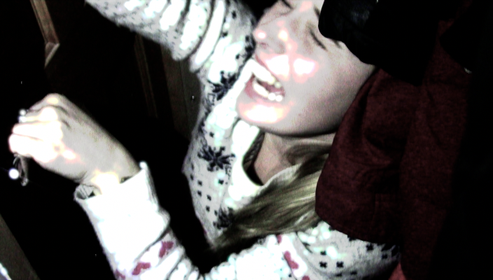
Editing was quite an important aspect in the creation of our trailer due to our horror genre. We had to use various effects and sounds to help enhance the horror aspect and visuals in our trailer. To do this, we used effects from final cut pro. For example, throughout the flashing images of the girl trapped in a cupboard, we used specific visuals such as filters including : hard light, and a projected film. To make these clips appear quick and suddenly, we used the flashing transition as it moved in and out of scenes. This helped to emphasise the characters fear, and keep the audience interested.


In terms of sounds, we decided to use various different sound effects over the trailer rather than one soundtrack or voice over. To do this we used sound effects by final cut pro, and recorded our own. We aimed to build up the layers of sound towards the end, including a heartbeat, police sirens, telephone dials and spooky violins. All of these sounds help to create tension towards the end of the trailer, which we felt was more effective than using just one soundtrack. At the beginning of the trailer, we used a deep drone, and then as the flashing images emerge, we added a lost signal sound effect, which fitted well with each scene. In the shot of the telephone ringing, we extracted the audio from the clip, and added our own ring tone. We also recorded voice notes for the dialogue of 'The end is near' and 'We've tracked the call, its coming from 22 park avenue'. To make these voices appear like they are over the phone, we added an audio effect called 'telephone' which made the voice notes sound slightly muffled. Here is a screen shot of the layered sounds towards the end of the trailer.
Making End Credits
When researching trailers we noticed each one had end credits to finalise the trailer. Key information was shown in these credits such as the production company, actors and people involved in the actual editing and making of the film.
 We made one similar by using final cut pro where we used an existing template and edited things such as colour, font and layout of the clip to fit in with our trailer. It includes our company logo, film production company, directors, costume design, production design, directors and actors who starred in our trailer.
 Here are the final end credits that we used in our trailer. Unfortunately a black background for the credits was not an option when editing the colours, we therefore chose a white background with black text on top. We feel that the credits are a necessary aspect in our trailer as it gives credit to the producers and reveals to the audience who stars in the film.

Friday, 27 February 2015
Filming problems and/or highlights
When filming our trailer we came across various problems and highlights. The first problem we came across was achieving the correct lighting when filming in a garage. This was due to it being dark outside and the light in the garage was not bright enough. To overcome this, we brought a lamp into the garage and put it at the side of the frame. In addition to this, we shone a spot light on the figure of the character, to bring out contrast between the dark background and foreground.
 Initially in our film plan, we were to use a house phone for a shot to create more of a homely feel. However, the house phone we decided to film was slightly broken, and therefore didn't dial or ring properly. This was therefore a difficulty as we had to film before the phone stopped ringing. We therefore decided against the idea of using a house phone, and decided to use a mobile phone instead.
 Throughout filming each scene we had to experiment with different camera shots and techniques to see which ones would be most effective. For example close ups, wide shot, action match. This was a time consuming process and took a lot longer than we initially planned.
A highlight when filming was the action match that we used when the mother walks out the door. This was effective as we has previously experimented with this shot in our camera angles and shots post, and we therefore felt confident when filming the scene.


A highlight when filming was the action match that we used when the mother walks out the door. This was effective as we has previously experimented with this shot in our camera angles and shots post, and we therefore felt confident when filming the scene.
Thursday, 26 February 2015
Final Magazine cover

Wednesday, 25 February 2015
Final film poster

Tuesday, 24 February 2015
Development of Film poster


We imported this image on to photoshop and used the magic wand tool to remove the background so we could create our own behind the image. We then added our film title in the same font used in our trailer. To make our poster more relatable to our genre we decided to add spooky effects to the image. To do this we found an online image editor. On this editor there were a wide range of filters and editing tools. In these four photos you can see the filters we experimented with however we chose the top left filter because we felt that some of them washed out the image to much and we wanted it to stand out.
Monday, 23 February 2015
Research into Film posters


Friday, 5 December 2014
Changes to our production company logo
Due to creating our logo in photoshop, we had great difficulties in transferring it onto final cut pro and fitting it in with our trailer. We therefore decided to recreate our logo however this time use motion to make it flow well with the trailer.

We also decided to change the name of our company, as we thought that it fitted more effectively with the graphics that we chose to include. To make this logo, we added different behaviours to our bold font, to make it emerge in, along with the blue lake in front. We also added a glow behind the letters, which is the same colour as the lake, bringing the whole thing together.

We also decided to change the name of our company, as we thought that it fitted more effectively with the graphics that we chose to include. To make this logo, we added different behaviours to our bold font, to make it emerge in, along with the blue lake in front. We also added a glow behind the letters, which is the same colour as the lake, bringing the whole thing together.
Thursday, 4 December 2014
Added props
We have come up with a few more ideas in terms of props for our trailer. At the very start of the trailer we would like to introduce the masked man, planning his crimes by circling photographs of his chosen victims and drawing out how he will commit the crimes. To do this we will need various photographs of our characters and a blue print sheet. To get this prop, we will print out a blue print sheet onto large paper, like the one below.
 We will also need to gather and print photographs of his main victim, and have the character circling her out, for example:
This makes the intentions of the man in the mask clear to veiwers and makes the audience wonder what he is plotting and why.

This makes the intentions of the man in the mask clear to veiwers and makes the audience wonder what he is plotting and why.
Subscribe to:
Posts (Atom)